(This is another post that comes from my invitation to all of you to send me two of your pictures to get my thoughts on them. Send two photos at 544 pixels/72 dpi to me at: tekamah at me dot com Explain something about yourself, the photos and what you'd like for me to address about them.)
I wanted to thank everyone who sends in their two pictures. I realize it takes guts to put your work out there to be talked about. There’s a bit of a backlog right now because I couldn’t get to them in the last week. In the meantime, here’s the next. And maybe I'll do two of my own at some point and see how hard I can be on me.
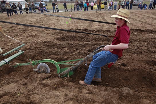
Rob Kerr is a photographer at The Bulletin in Bend, Oregon, one of the loveliest places on the planet. He recently made pictures at an event that featured a horse-drawn plowing competition. His two pictures show 14-year-old Jacob and a pair of draft horses plowing. A critical element is getting the furrow straight and he’s competing against much more experienced farmers.
Here are the pictures:
 Both photos by Rob Kerr, The Bulletin in Bend, Oregon
Rob says of the first photo: On his last pass of the plot, Jacob’s body language reflects his exhaustion; and of the second picture, Jacob is looking back with a twinge of disappointment with his mediocre performance – meaning crooked rows.
And Rob asks about getting the right moment and how to choose between two equal but different images. (It’s worth noting that the newspaper chose to run a different, and I gather more literal photo that shows the horses.)
Both are equally fine photos so I don’t think one is better than the other. There is a little more storytelling in the second photo, when he looks back - the moment value is higher. But had you not said he was disappointed, I wouldn’t have known that.
Rob is correct to begin by assessing the quality of what’s going on, when he refers to the exhaustion of one setting and the disappointment of the other. Striving to make pictures in a way that conveys those qualities is the goal. Each of the situations and qualities is different from each other so each photo should be quite different in how it was made. Not so, in this case. Each of these compositions is generic so even if the qualities exist, you don’t feel them from the way the pictures were made.
What do I mean by generic? Take the oval test on each - draw and oval in the frame and if what’s outside the oval isn’t important, the approach to the photo is generic. Then consider distance from the subject - it’s there to get the scene in, generic. Quality of light is neither here nor there. Composition is pretty much one plane and similar one to the next, though there is some ping between the boy and the horses’ asses in the second photo, which may not be good. Moment is better in the second, color is also not a factor.
The tendency for a lot of people is to align the action layer of a scene parallel to the film plane, to the camera. That’s the case with these photos. It’s generally a self-defeating approach, it deadens the flow through the frame.
So how could these two have been better. The second step, after you understand what quality to convey, is to ask yourself where that quality happens in the scene, how many elements are there to that quality, how much or how little of the scene do you need to show and then, how to use each of the five elements listed above to most strongly convey that quality. All of that assessing should take about 1.2 seconds, once you’re accustomed to thinking and seeing in this way.
So for the first photo, the quality is exhaustion brought about by effort with a strong dose of precision which is contradictory to working with mammoth horses. (Seeing yin and yang like this gives better footing to construct a frame. And this often reveals a higher quality on which you can build the frame, in this case it is one of opposites.) One approach to making this picture would have been to get high and close and let the rows he’s plowed run behind him, with some part of the horses in the foreground. That would give a sense of the task, his stature, and waiting for a moment when he emotes brings it together.
Taking the five element approach: color. Red and green are opposites so think about how to incorporate that; light is from overhead, which could create a feeling of weight either from a high or a low perspective; moment, you build the frame and wait for the camera to capture the moment by releasing the shutter precisely; distance, it’s an intimate, connected, tactile venture plowing with horses so get close, build on textures; composition, sense of space is most important so build the composition from very close to infinity and place every element carefully.
As an aside, the second photo was made with a 16 mm lens on a full frame chip camera. I can count on one finger the number of situations for which that lens is appropriate. Other than that one setting, using a 16 is like looking at the world through a glass ball, it distorts, flattens, skews, corrupts. Tape the zoom so it won’t go below 24, or trade the 16-35 for a 24-105.