(This is another post that comes from my invitation to all of you to send me two of your pictures to get my thoughts on them. Send two photos at 544 pixels/72 dpi to me at: tekamah at me dot com Explain something about yourself, the photos and what you'd like for me to address about them.)
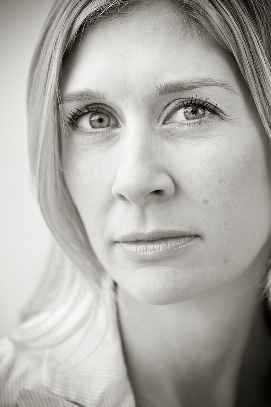
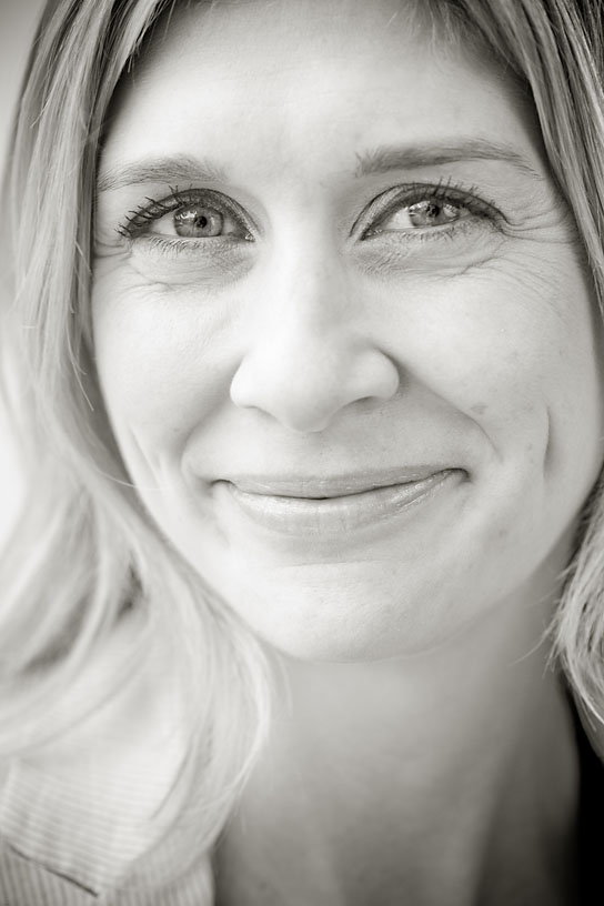
Phoenix Arizona Republic Staff Photographer Michael McNamara sends two portraits of Marie Tillman, the wife of Pat Tillman. Pat was the pro football player turned soldier who was killed in Afghanistan by friendly fire.
 Both photos by Michael McNamara/The Arizona Republic
Of the photos, Michaels says: “I set up three different looks, but while I was shooting, I realized that two of them were useless, and I put my 100 macro lens on and switched to the third setup, which was very tight. I came away from the shoot with two images that I liked, but that felt incredibly different.’
‘I'm wondering if which portrait the viewer likes is based on the feelings they project on her and what she has been through with the death of her husband and the runaround that the government still gives in relation to his death. My favorite is the one of her with the stoic look, while the magazine that we publish used the one of her smiling. Are these even good portraits?”
No doubt people bring themselves to these and all pictures. It used to kill me when people in newsrooms would make judgments about photos from their own biased perspective but present that perspective as if it were some universal, unquestionable viewpoint. The less varied people’s experience, the more likely they are to respond to pictures from a singular perspective and therefore lock onto a simplistic quality or aspect of a photo. And the converse is true – the more of life on the planet you have experienced and understand, the more sophisticated your expectations of and responses to the world, including photographs.
(There also seems to be a correlation between knowing more and understanding less. But that’s a different post.)
Knowing that people span the extremes, it’s best to strive to make pictures that can appeal to as great a range of people as possible. Building as many layers as possible for people to respond to is the key. Making pictures that convey a quality and are founded on relevant information is one way to build in more layers.
But back to these two pictures. I didn’t remember who Pat Tillman was until I refreshed my memory. So I brought nothing to the pictures initially, other than responding to them as pictures of a woman. Which brings out another point: Pictures of notable people that rely mostly on their notoriety to be good aren’t good, in the same way that informationally significant photos that aren’t visually strong aren’t good either.
As images these two pictures are pretty much equals, so your preference depends on where you’re coming from. That you can see a bit more of her shirt helps the non-smiling photo because it gives a little more to respond to. This is what I meant above about including things that add more layers. It doesn’t have to be a lot of stuff, just showing what she chose to wear that day adds another layer to which people can respond. Simple is good, but too simple is not.
In choosing the smiling photo, I’m guessing your magazine wanted to convey a more pleasing feeling that may or may not have anything to do with the tone of the piece.
On a technical note, macro lenses have flat optics. Use them for portraiture and they’ll tend to flatten people’s faces, especially if you use flat light and reduce the contrast in post production. The goal is to create a feeling of roundness, not flatness. That’s a partial answer to the question of whether these are interesting photos. They are more than mug shots but less than engaging portraits.
In the few minutes you had, how could the photo have been better? Striving to say something about her would be the starting point. These feel like nice renderings of what she looks like but don’t convey a quality. For instance, you could play on this tumultuous period of time for her by creating very contrasty, moody lighting. Isolate her in a pool of light from above. Or strong side lighting.
What keeps this frame from being more successful? A catch light is essential but the odd shapes of the reflected setting in her eyes detract. The lens, flat light and being even with her nose makes her nose look huge. Almost always shoot slightly down on women in straight-on portraiture. It’s more flattering and engages you in their eyes.
I’ll stop here.